RGB or CMYK in Procreate? Choose for the Destination
Choose RGB or CMYK from the destination's actual specification. Procreate cannot switch an existing canvas between them, so keep the native master for each handoff.
Choose and save colors for the drawing, use ColorDrop for a fill, and check the output profile before committing to a canvas. Each solves a different color problem.
Procreate's Color Panel offers Disc, Classic, Harmony, Value and Palettes. They give you different ways to choose and retain color. You do not need to use every view for one drawing.
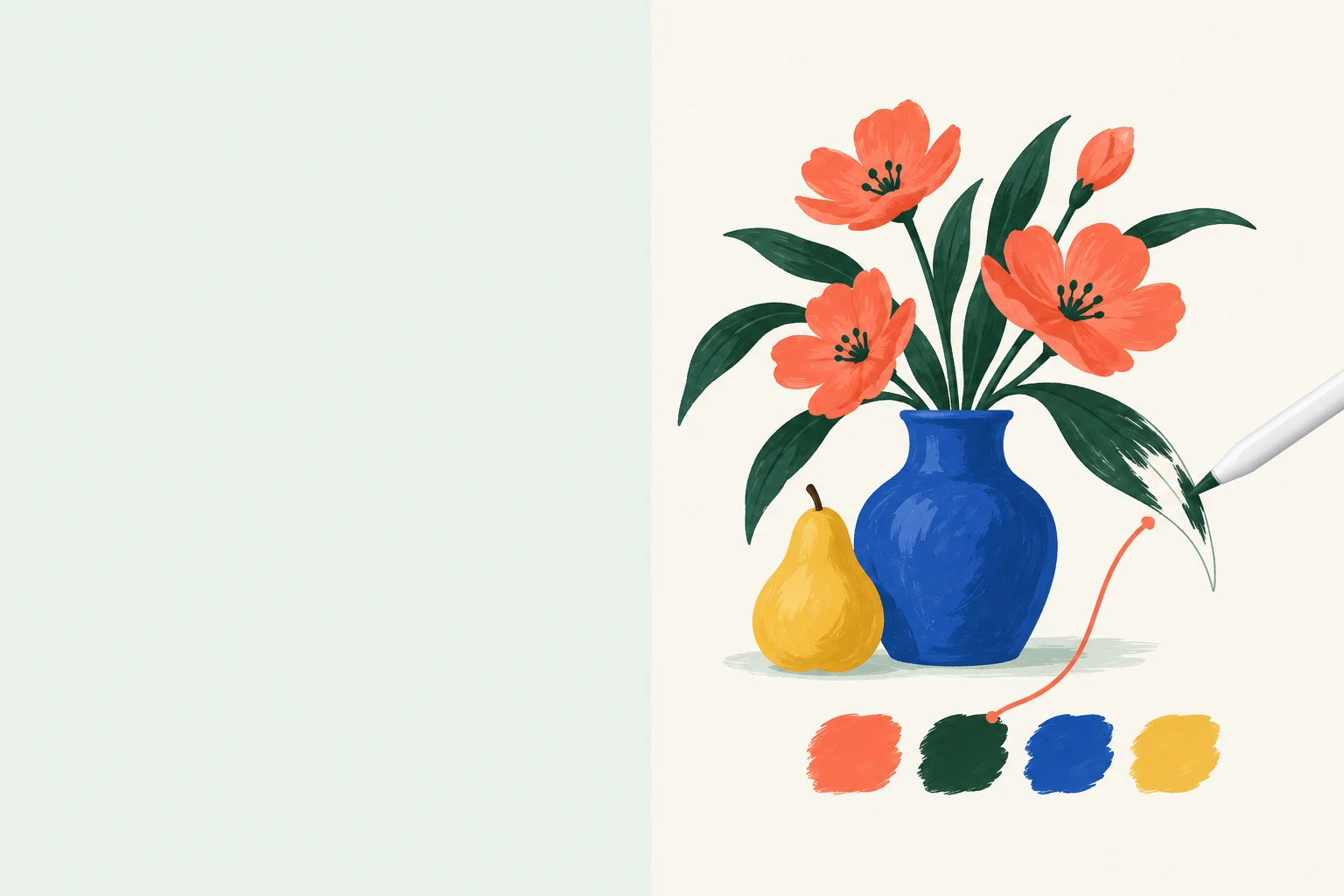
I would begin with a few colors that have clear jobs in the image, such as a background and a contrasting subject. Save the colors you actually choose, rather than filling a palette with options you do not need. The Palettes handbook explains how to save the current color in an empty slot of the default palette.
For a photograph, New from File or New from Photos creates a palette from the image. Importing a .swatches file instead brings in an existing palette.
If you need a starting relationship between hues, Harmony offers color schemes based on color theory. Treat a suggested scheme as a starting point. It does not establish whether lettering has enough contrast or whether your subject stands out from its background.
ColorDrop starts by dragging Active Color into the artwork. To change its Threshold, keep holding the drop, then slide left to lower the percentage or right to raise it. There is no useful universal percentage: the boundary and the intended area determine the adjustment.
When a fill escapes, inspect the outline and the layer receiving the color before repeatedly raising the threshold. A different layer arrangement may be needed if you want to keep the inks untouched. Procreate recommends combining ColorDrop with a Reference layer so the fill can follow the linework while the color stays separate.
For shading that should remain editable on its own layer, return to the clipping-mask choice in the mask comparison. Filling a region and constraining later brushstrokes are related, but they are not interchangeable operations.
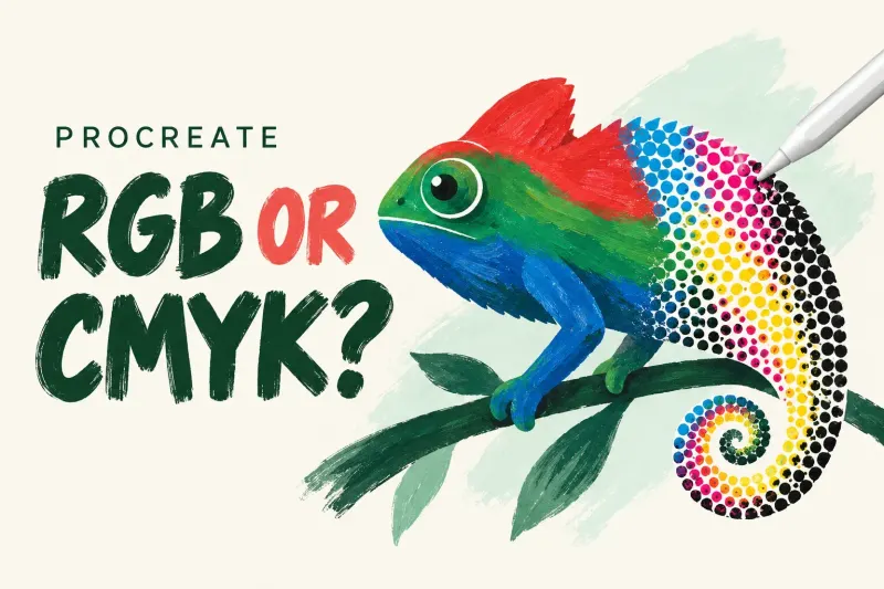
RGB suits screen artwork. For print, ask the provider which color space and profile it accepts before assuming that every job requires CMYK. Procreate's Profiles handbook describes RGB and CMYK choices for a custom canvas.
The important limit is that Procreate cannot switch an existing canvas from RGB to CMYK, or the reverse. Changing a profile stays within the canvas's chosen color space. I would settle that delivery requirement before investing in a finished piece; changing the palette later does not solve a color-space mismatch.
Color is only part of the delivery specification. Continue to the canvas and export hub for pixel dimensions, physical print size and the difference between an editable file and a delivery image.
Use a palette route to choose reusable colors, a fill route to control where color lands, and a profile route to prepare the right output. These guides keep the detailed procedures separate.
A palette supplies the colors you select. A profile describes how color is interpreted for the intended output. Choose the guide for the decision you actually need to make.
Start with the general ColorDrop checks when you cannot identify the failure. Use the threshold guide when the fill works but leaves an edge or crosses its boundary.
Confirm the recipient's requested format and profile against the file you plan to send. Keep the editable original separately so the delivery copy does not become your only version.
If the color looks wrong only after export or in another app, record which file was opened and where it was viewed. That gives the troubleshooting route a specific symptom to investigate instead of treating every difference as a palette problem.