
Blend modes change how a layer's colors combine with the layers beneath it. For a shadow I'd start with Multiply or Darken, for a highlight Screen, and for a contrast change Overlay or Soft Light. Keep the underlying artwork visible while you compare: the same color can look different over a light painted area or a dark painted area. Judge each candidate over the actual painting.
Before changing the artwork, swipe left on its Gallery thumbnail and choose Duplicate to preserve the original. Open the working copy and leave the original unchanged. If you duplicate only an effect layer and leave both versions visible, you change the layer combination you're judging. Keep only one candidate effect layer visible.
Open the menu on the layer you mean to change
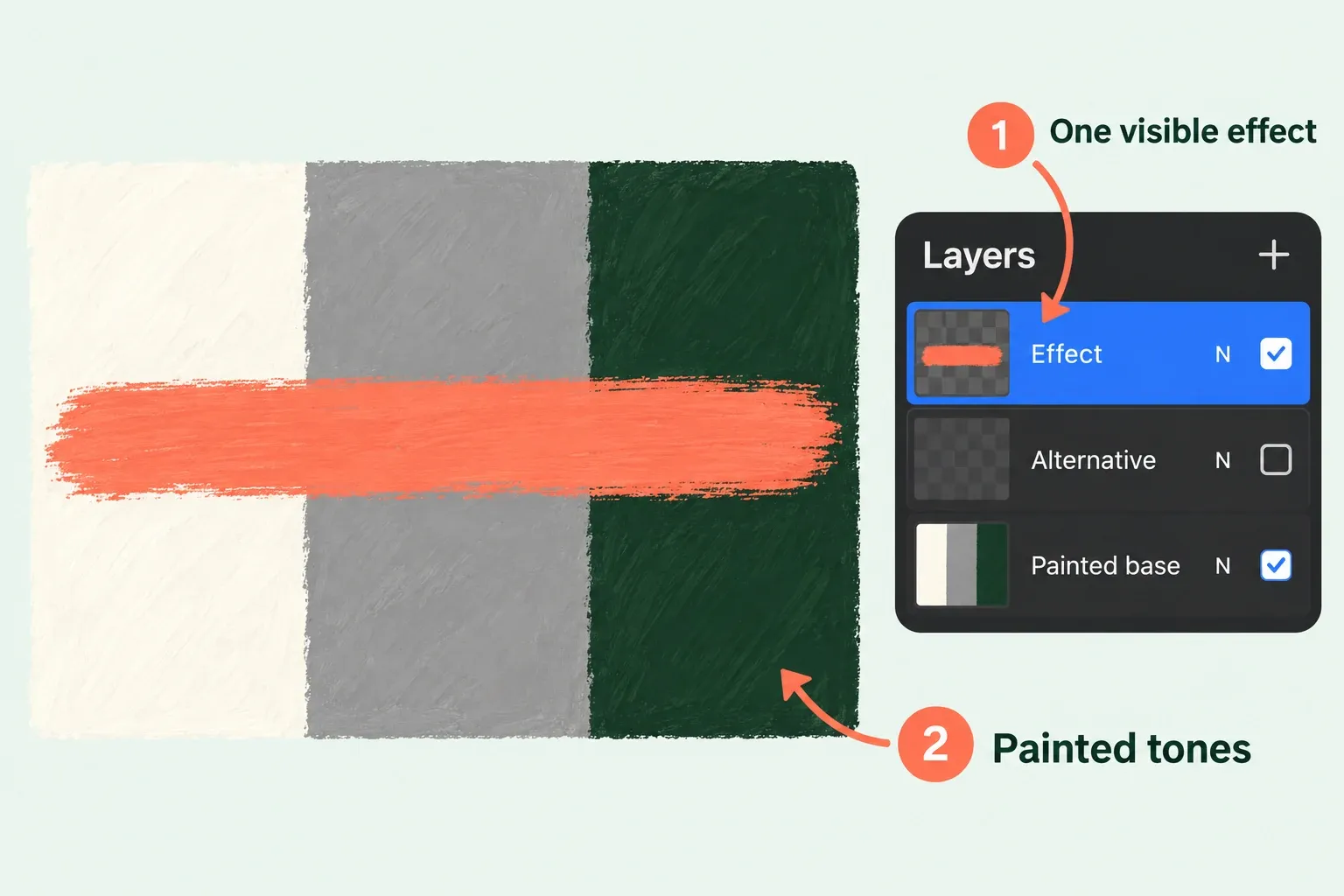
Tap the Layers button, the overlapping squares in the upper-right menu bar. Use a painted base with opaque light, midtone and dark areas for the comparison. If an effect layer already exists, tap to select it and check that it sits above the intended painted base. If you need a new effect layer, select the painted base, then tap + in the Layers panel to create a layer above the active layer. Put the color or marks you want to compare on that separate layer. Confirm the intended effect layer is selected: the active layer is highlighted in blue.
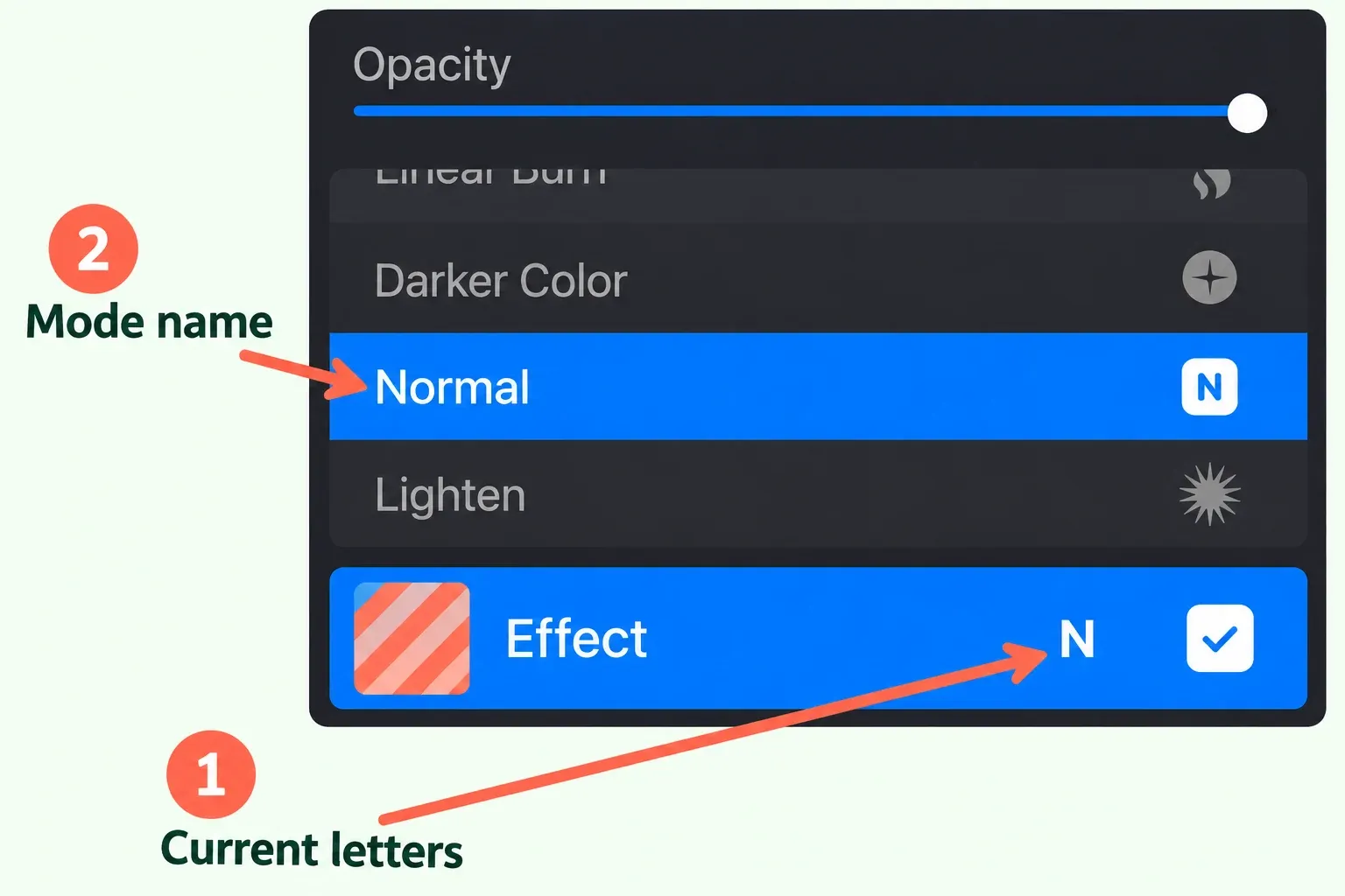
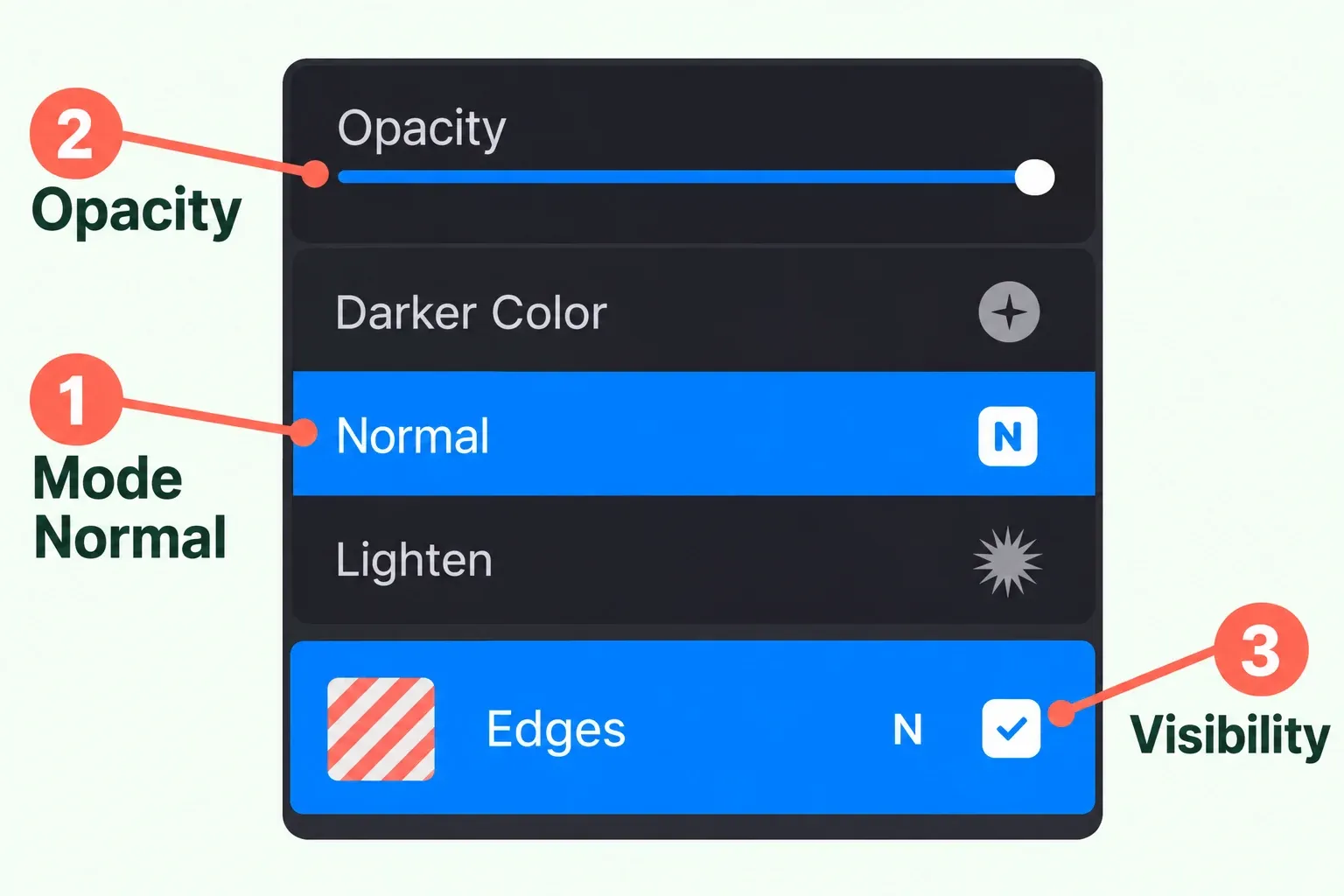
Before comparing, note that effect layer's current mode, opacity and visibility so you can restore them. Tap the small letter or letters at the right of that same layer. N means Normal, the default. A layer using another mode shows that mode's letters. Tap the current mode name to open the scrollable list. As you scroll, each mode applies to the layer so you can preview it on the canvas. When the desired mode is selected, tap outside the list to close it and keep that choice.
The same menu has an Opacity slider. Move it left to make the layer more transparent, or right to make it more solid. The slider changes the opacity of the entire layer, ignoring a current selection. If only part of the art should change, I'd keep that part on a separate effect layer, because the slider won't confine itself to a selection.
Match the mode to the visual job
For a shadow or darker color interaction, begin by comparing Multiply with Darken. Multiply darkens through the luminosity of the base and blend colors; Darken retains the darker color. For a warm shadow on pale skin, compare the two over the actual painting and judge the edge and color interaction.
For highlights, Screen brightens according to the blend layer's luminosity. Overlay shifts midtones; Soft Light produces a gentler effect with less harsh contrast. Preview these on the same patch of art at the same opacity before you decide. Lowering layer opacity can soften a strong blend result.
Older files need one version-specific check. Since Procreate 5.4, older projects using Darken have been switched to Shade so the current Darken mode has better parity with other digital art software. If an inherited artwork looks different after an update, check its actual mode label before assuming the pixels changed.
Check more than one background
Put the same test color over a light painted area, a dark painted area, and a neutral painted midtone. Keep the patch, painted base and layer order unchanged while comparing modes at one equal opacity. Use Normal on that same effect layer as the reference for how its marks look without a special blend rule. Compare candidates at full opacity first. If you then lower it to judge strength, use the same lower setting for each candidate.
For a with-effect and without-effect comparison, tap the effect layer's Visibility Checkbox to hide or show it. Keep the painted base visible. Use an ordinary tap: pressing and holding the checkbox invokes Solo visibility and changes which other layers you see.
To keep a new mode, leave it selected and tap outside the list, then retain the opacity you deliberately chose. To return to the prior state, reopen the effect layer's letters menu, tap its current mode name, scroll to the mode you recorded, and tap outside. Restore the recorded opacity with the slider and the recorded visibility with the checkbox separately. Choose Normal if you want to remove the special blend rule. Selecting Normal alone doesn't reset opacity or restore a different original mode. Restoring those settings doesn't undo paint edits or changes to layer order, so the unchanged original copy remains your reference.
When the artwork will be exported, inspect the flattened output as a separate handoff. A pleasing canvas preview doesn't by itself verify color behavior in another app, on another display, or in print. Check the canvas working space and receiving file's color-profile requirements as part of that handoff.