
To make a stamp in Procreate, draw your design in white on a black, square canvas, copy it, and paste it into a new brush through Brushes → + → Create new brush → Shape → Edit → Import → Paste. Then push Stroke Path → Spacing to Max, set Apple Pencil → Opacity to None, turn on Properties → Use Stamp Preview and tap Done. Each tap now leaves one full-strength copy of your design.
Rename the brush afterwards from the Brushes list with tap and hold → Rename, because since Procreate 5.4 the name can't be edited inside Brush Studio.
A stamp is an ordinary brush with its gaps opened up. Tap the canvas with any brush and you already see its shape as a single stamp instead of a stroke; the Brush Studio settings page describes Spacing as how many times that shape stamps itself along the path. The real work is making one stamp come out clean: upright, sharp, and the size and color you expect.
How should you draw the stamp design?
Three things decide most of the result before you open Brush Studio: the canvas shape, the canvas size and the tones of the design.
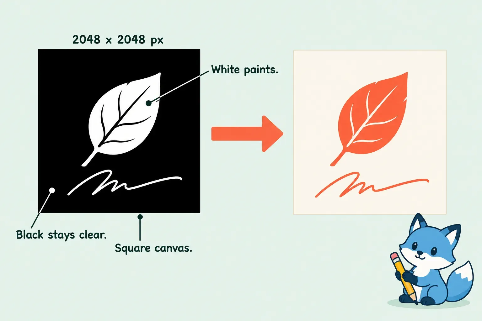
- Use a square canvas. RetroSupply's brush guide notes that Procreate auto-stretches other ratios to fit a square, so a wide logo on a wide canvas comes out squeezed. A long signature still goes on a square canvas, with empty space above and below it.
- Make it big. In a Folio thread about blurry custom brushes, a reply puts the ceiling for a Shape or Grain source at a 2048 × 2048 pixel square: bigger files are resized automatically, and much smaller ones paint blurry. I'd set the canvas to 2048 × 2048 px, because that's the most detail the shape can hold and nothing is lost in the resize. Rebecca Flaherty's signature stamp tutorial asks for at least 2000 pixels wide, which lands in the same place.
- Draw in white on black. A Folio moderator explains in a help thread on custom brush sources that white in a Shape source paints fully opaque, black is completely transparent and gray falls in between. Tap the Background color layer, pick black and draw in white; the canvas then looks the way the stamp will paint. Kelly Leigh's stamp tutorial uses the same setup.
Keep the design on its own layer and center it. Tap Transform, turn on Snapping and drag the design until it locks to the middle of the canvas; the guide to Snapping and Magnetics shows which of the two is pulling your selection. Flaherty centers her signature with both switched on. An off-center design lands off-center from where you tap, which is easy to miss until you place a signature in a corner.
A design you've already drawn dark on white doesn't need redrawing. The Shape Editor inverts it with a two-finger tap, covered in the next step.
Paste the design into a new brush
- Copy the design. In Layers, tap the design layer and choose Copy, which copies only that layer. To take the whole canvas, swipe down with three fingers and choose Copy All; Kelly Leigh and the Leila & Po stamp brush guide both use that route.
- Create the brush in the right set. Open the set you want the stamp in, tap + at the top right of Brushes and choose Create new brush. The Brush Library page confirms the brush is created in your current set, and Brush Studio opens right away.
- Paste it into Shape. Tap Shape, then Edit at the top right of the shape preview to open the Shape Editor. Tap Import → Paste.
- Check the tones. If the preview shows a dark design on white, two-finger tap the image to invert it. Tap Done to close the editor.
- Keep the grain plain. A textured grain punches speckles into a logo. A reply in a Folio thread on clip-art stamps gives the same advice: keep the grain plain white. If yours isn't, fill a layer with white, copy it, and paste it through Grain → Edit → Import → Paste.
Folio replies also suggest a shortcut: duplicate a brush that already stamps well and replace its Shape Source with your image. The built-in Water set, for example, includes stamp brushes for splashes, flicks, blotches and drips. I'd start from + for a logo or signature anyway, because a duplicated stamp brings along whatever grain, rotation and pressure settings it had, and each one has to be checked again.
The same paste route works for any photo or drawing. The guide on turning a photo or drawing into a brush covers cropping, removing color and raising contrast before you copy.
Make one tap leave one stamp
A new brush draws strokes, not stamps. These settings turn each tap into a single, full-strength copy. Change them in Brush Studio and test on the Drawing Pad as you go.
| Where | Setting | Why |
|---|---|---|
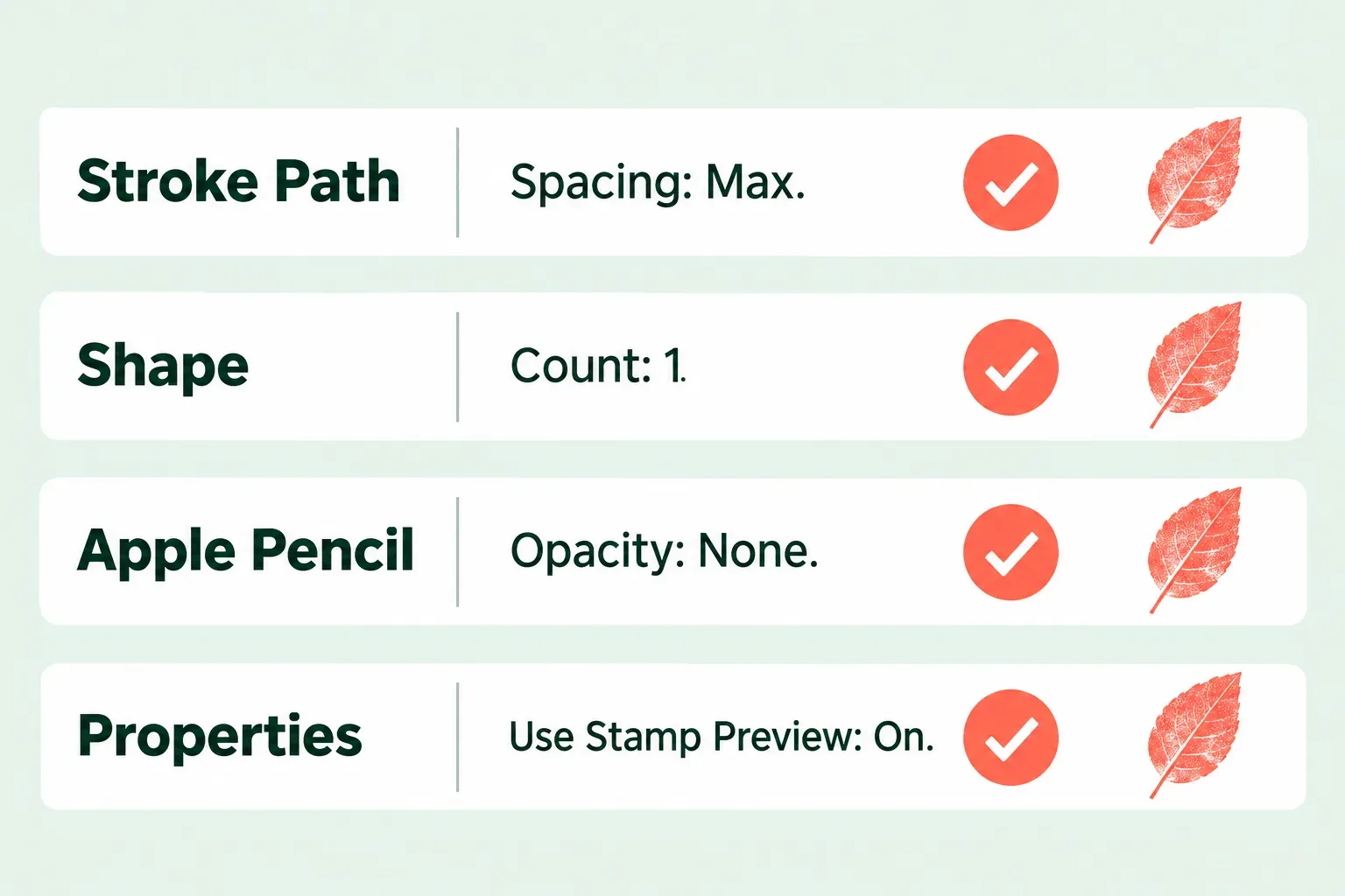
| Stroke Path | Spacing: Max | High spacing separates the stamps along the path; at the far right, a tap or a short drag leaves one image |
| Stroke Path | Spacing Jitter, Jitter Lateral and Jitter Linear: 0% | Jitter moves stamps sideways or along the stroke, so the copy no longer lands where you tap |
| Shape | Count: 1, Count Jitter: 0% | Count can stamp the shape up to 16 times at each point |
| Apple Pencil | Opacity: None | A light tap prints at full strength instead of faintly |
| Apple Pencil | Size: None | A light tap prints at full size instead of smaller |
| Properties | Use Stamp Preview: On | The brush list shows one stamp instead of a stroke |
| Properties | Maximum Size | Sets the top of the size slider, so raise it if the stamp can't get big enough |
A reply in a Folio thread on single-image stamps gives the core move: Spacing all the way to the right stamps a single image, and Maximum Size further right gives it more room. The Handbook adds why the jitter sliders matter: high Spacing Jitter still changes the gaps even at 0% Spacing, and a high Jitter Linear makes stamps extend before and after the start and end of a stroke. The spacing and jitter section of the brush settings guide shows each slider's effect on an ordinary stroke.
My default for a signature or a logo is to set both Apple Pencil Opacity and Size to None, because a stamp is supposed to look the same every time. The Leila & Po guide turns Opacity down for that reason, so the brush stamps at full opacity even with zero pressure. For a decorative texture stamp, leaving pressure on Size can be useful, since a lighter tap then gives a smaller copy.
Use Stamp Preview often makes the thumbnail too big, so lower Preview Size in the same Properties panel until the stamp fits its row. Then tap Done. To name the brush, close Brush Studio, tap and hold it in the Brushes list and choose Rename. Kelly Leigh's tutorial still points to About This Brush for the name, which belongs to versions before 5.4.
Why does my stamp tilt or turn?
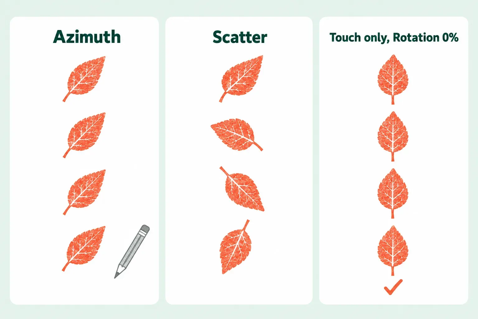
A stamp that leans with your pencil is reading tilt. Under Shape, Input style offers Touch only, Azimuth, or Azimuth and barrel roll, which needs Apple Pencil Pro. Azimuth reads which way the pencil is tilted, like a calligraphy pen, and the Handbook notes that it overrides Rotation for strokes drawn with Apple Pencil.
For a logo or signature that should print straight every time, set these under Shape:
- Input style: Touch only, so the Rotation setting controls the shape instead of the pencil.
- Rotation: 0%. At 0% the shape keeps its direction whichever way the stroke travels; at 100% it rotates to follow the stroke.
- Scatter: 0%, because Scatter randomizes rotation on every stamp.
- Randomized: off, because it rotates the shape at the start of each stroke.
Under Properties, Orient to Screen decides what happens when the iPad turns. Off keeps the shape oriented to the canvas however the device rotates; on keeps it oriented to the device's current position. I'd leave it off for a signature, because the stamp should match the artwork, not the way you happen to hold the iPad.
Decorative stamps are the opposite case. For leaves, stars or confetti, turn Scatter up and Randomized on, and each tap lands at a fresh angle, so a row of stamps stops looking copied.
Keep the stamp sharp at the size you use
Blur comes from the source, not the stamp settings. A shape built from a small canvas has fewer pixels than the size you stamp it at, and the same Folio reply warns that a source much smaller than 2048 px paints blurry. Rebuild the design on a bigger square canvas and paste it again; going past 2048 px won't add detail, because the app resizes it down.
The edge itself is set under Shape → Shape Filtering:
- No Filtering doesn't soften the edges at all. It keeps every detail but can look jagged.
- Classic Filtering softens the edges with the settings from earlier versions of Procreate.
- Improved Filtering uses the updated antialiasing.
I'd keep Improved Filtering for a hand-drawn signature or logo, because the smooth edge reads cleaner on a finished piece. No Filtering is worth trying when the design is made of hard pixel edges you want kept exactly.
If the stamp stays too small even at the top of the size slider, raise Properties → Maximum Size. Flaherty points to the same fix when a signature won't get big enough on a large canvas.
Can a stamp have more than one color?
Not on its own. A Procreate stamp paints in the color you've picked, because brushes read the shape as grayscale only. A reply in the clip-art thread spells out the consequence: a brush can't paint an image with several colors, and gray tones change the opacity of your color, not the color itself.
Three workarounds cover most needs:
- Two colors, outline and fill. Make one stamp brush from the outline and one from the fill, then combine them as a Dual Brush, whose Combine Mode is Normal by default. In a Folio thread on two-color stamps, the outline brush is the Primary, with Color Dynamics → Color Pressure → Secondary Color pushed to max, and the fill is the Secondary brush. The Handbook describes that Secondary Color Pressure setting as moving the stroke from the primary to the secondary color.
- A new color each tap. Color Dynamics → Stamp Color Jitter → Hue makes each stamp deviate from your chosen color, which suits confetti or leaves.
- Full-color art. Keep it as an image, not a brush. Save it as a PNG and bring it in with Actions → Add → Insert a photo or Insert a file.
My default for a colored sticker or logo is the image route, because a brush will always flatten it to one color, while an inserted PNG keeps every color and stays editable on its own layer.
Keep the stamp at hand and share it
The Recent set holds up to eight brushes and changes as you work. To keep a signature stamp at the top, open Recent, swipe left on the stamp and tap Pin. Flaherty keeps her signature brush pinned in Recent the same way.
To share one stamp, swipe left on its thumbnail and tap Share; Procreate packages it as a .brush file. If you've downloaded someone else's stamp brushes, the steps to import a brush file and find where it landed apply to stamps the same way.
Why does my stamp repeat, blur or come out wrong?
| What you see | Likely cause | What to do |
|---|---|---|
| A row of copies from one short drag | Spacing is too low | Stroke Path → Spacing: Max |
| Several copies stacked or scattered from one tap | Count is above 1, or Count Jitter is on | Shape → Count: 1, Count Jitter: 0% |
| The copy lands away from where you tap | Jitter in Stroke Path, or an off-center design | Set the jitter sliders to 0% and recenter the design with Snapping |
| A solid square | A dark design on a light background, so the background paints | Two-finger tap the shape in the Shape Editor to invert it |
| Nothing appears | A black design on a transparent background, which reads as clear | Redraw it in white, or put it on a solid background and invert it |
| Faint or smaller on a light tap | Pressure still controls Opacity or Size | Apple Pencil → Opacity: None and Size: None |
| It leans or turns | Azimuth, Scatter or Randomized | Input style: Touch only, Rotation 0%, Scatter 0%, Randomized off |
| Blurry edges | The source is much smaller than 2048 px | Redraw on a bigger square canvas and paste again |
| It won't get big enough | Maximum Size limits the slider | Raise Properties → Maximum Size |
| Squashed or stretched | The source wasn't square | Copy from a square canvas |
| Speckles or holes inside the design | A textured grain | Paste a plain white grain |
Change one setting at a time and tap the Drawing Pad after each, so you know which slider fixed the stamp. Done keeps your changes; Cancel discards everything since you opened Brush Studio.
This is an independent guide. It is not affiliated with or endorsed by Procreate.