
For controlled outlines, I would start with Monoline. For an inking brush to use over a sketch, start with Studio Pen. Choose Chalk when a textured outline is part of the design, or 6B Pencil when you want to keep a pencil character in the finished lines. You can make these choices from Procreate’s built-in brushes before looking for a download.
These picks rest on Procreate’s handbook and official lessons. The Chalk and 6B examples come from its Procreate 5.2 workbook, and the brush locations follow the current Procreate 5.4 Classic Library.
Find the Classic brushes in Procreate
Tap Paint, then tap the selected Paint icon again to open Brushes. To reach the library overview, pinch inward on that view, or tap the current library title and choose Back to libraries. Open Classic Library, then the set named in the table below.
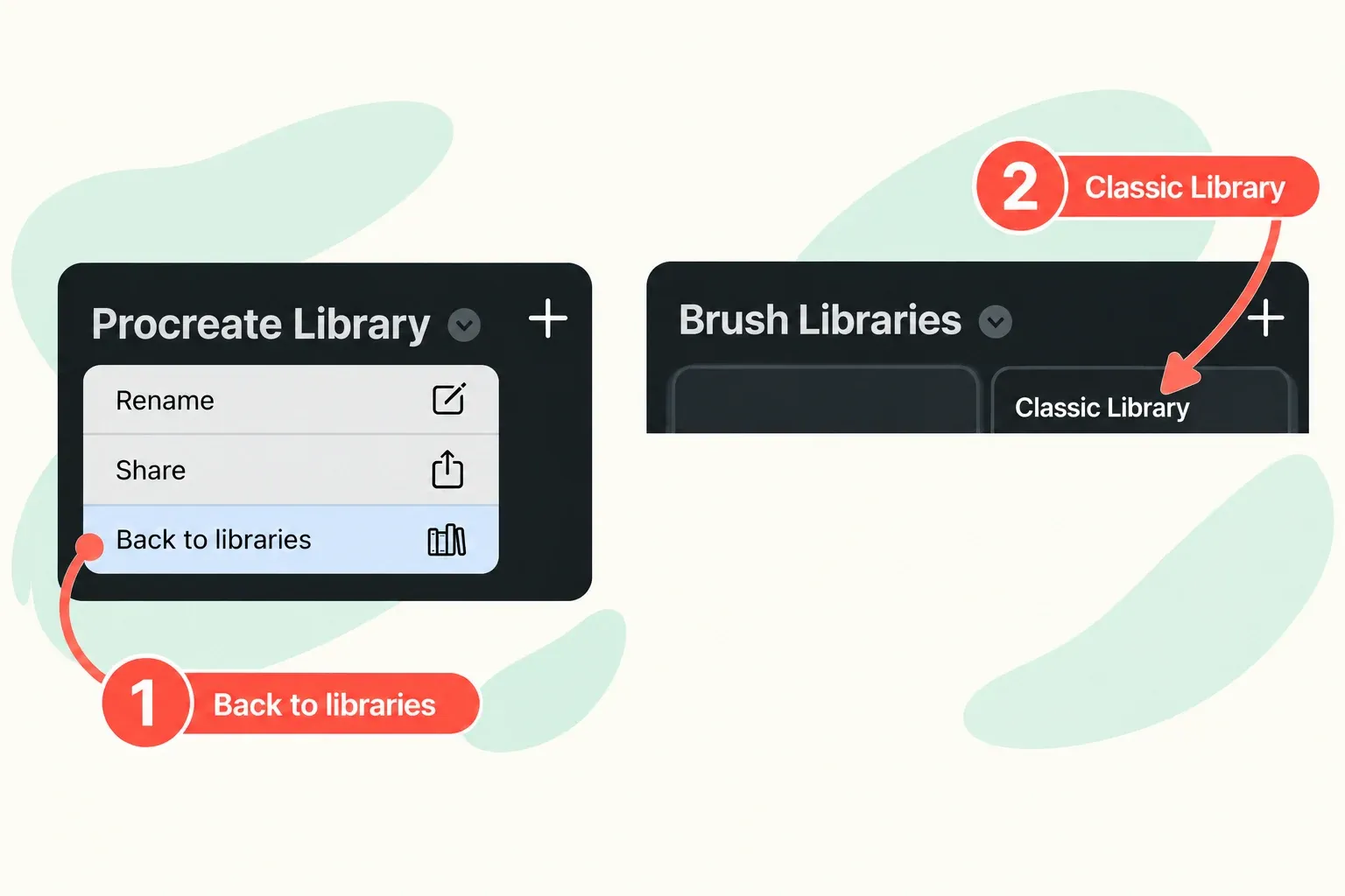
The Classic Library retains Sketching, Inking and Calligraphy. So if an older tutorial points you to “Inking”, look in Classic Library. The newer Procreate Library uses different sets, such as Pencils, Pens and Inks. If you can’t spot a brush, swipe down from the top of Brushes to search its name; the search includes results from other libraries.
Choose a brush for the line you need
Pick the character of the finished line first. A neatly controlled contour, a textured border and a pencil sketch can all be good line art, but they ask different things of a brush.
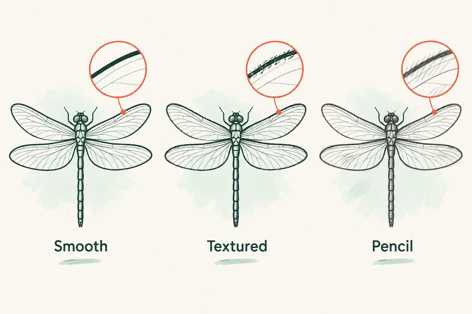
| Your priority | Starting brush and location | Why I would begin here |
|---|---|---|
| A controlled contour | Classic Library → Calligraphy → Monoline | A stock brush in Calligraphy, whose brushes have StreamLine enabled. |
| Inking over a sketch | Classic Library → Inking → Studio Pen | A documented starting option in the stock Inking set. Shape its response around the contour you need. |
| A textured outline | Classic Library → Calligraphy → Chalk | Procreate’s 5.2 lesson uses Chalk for visibly textured outlines around mountains. |
| Pencil character in the final drawing | Classic Library → Sketching → 6B Pencil | The same official workbook uses 6B for drawing, with darker marks under firmer pressure and tilt for shading. |
Monoline: begin with control
I’d choose Monoline first for a simple icon, leaf outline or tidy border: all Classic Calligraphy brushes have StreamLine enabled. Keep the line readable at its final viewing size, and use a smaller brush size for details than for the outer contour.
If an even line weight is essential, judge the marks on your own canvas. A brush name alone doesn’t tell you how an edited copy, pressure settings or stroke ends will behave. Choose a width that serves the drawing rather than forcing every detail through one size.
Studio Pen: start in the Inking set
Choose Studio Pen when your next step is to turn a rough sketch into finished ink contours. Procreate names Studio Pen in its brush troubleshooting guidance, and describes the Classic Inking set as suited to cleaning up artwork and drawing in ink-based styles. Those are useful reasons to start here.
Decide whether the outer contour should be heavier than the internal lines. If so, change size between those two jobs. If you want variation within a single stroke, check the pressure and taper controls on a duplicate rather than assuming a particular default.
Chalk: let the edge carry texture
For an outline with a rougher, handmade character, I’d choose Chalk before trying to texture a smooth contour afterward. In the official 5.2 mountain lesson, on page 28, Chalk adds off-white outlines with a visibly grainy edge. In 5.4, look under Classic Library → Calligraphy.
Use that example as a direction for the design: a textured border can be the point of the line. Check the smallest detail you need at the intended viewing size. If its shape becomes hard to read, give that detail a simpler contour or reserve the texture for larger forms.
6B Pencil: keep the drawing pencil-like
Choose 6B Pencil when the finished picture should retain a sketched character. The official workbook’s pages 6–7 use 6B Pencil from Sketching and describe firmer pressure making it darker, with tilt used for gentle shading. Its current location is Classic Library → Sketching.
I’d keep this separate from a clean-ink task. Start with the visible contour you need, then add shading where it explains the form. Pressure-dependent variation also needs a Pencil that supports pressure.
Use size deliberately, and check your Pencil
The upper sidebar slider controls brush size; the lower one controls opacity. For a simple line-art hierarchy, choose a heavier size for the outer shape and a thinner size for internal detail.
Apple Pencil USB-C has no pressure sensitivity. Pressing harder with that model won’t provide pressure-driven changes, so use the size slider when you want different line weights. With a pressure-capable Pencil, a brush’s Apple Pencil settings can map pressure to size and opacity, as well as other properties. Pressure response is a separate choice from smoothing the line path.
Smooth a contour on a copy
If the brush’s character suits the drawing but the contour needs more control, adjust a copy. A duplicate keeps the brush as it is now. It doesn’t turn a previously edited brush back into a factory preset.
- In its set, swipe left on the brush and tap Duplicate. Keep the original for comparison.
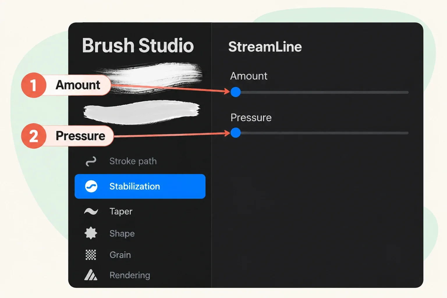
- Select the copy, then tap it again to open Brush Studio.
- Choose Stabilization → StreamLine → Amount. Raise Amount a little if you want a smoother contour. The Handbook describes higher Amount as smoother and lower Amount as more natural.
- Draw a curve and a small corner in the Drawing Pad. Look for the amount of control you want without losing the turn or movement that gives your line its character. Lower Amount if you want more of that movement retained.
- Tap Done at the top right to save, or Cancel to dismiss the changes. Check the saved copy on a small part of your actual drawing before committing the whole outline to it.
There’s no single useful Amount percentage for every brush and drawing. Change one control at a time. StreamLine’s Pressure slider smooths pressure application, whereas Amount smooths line movement. It isn’t the control for deciding how much pressure changes brush size.
For ends that taper, changes in width or a different texture, use the guide to Procreate brush settings to choose the relevant control. Adding more smoothing doesn’t answer those separate questions.
Save the brush you chose
Give the tuned copy a name you’ll recognize later, such as “Monoline contour.” In Procreate 5.4, tap and hold the brush in the main Brushes view, then choose Rename. Record the source brush and any settings you changed so you can distinguish your copy from the original.
For a separate backup of that brush, swipe left on its thumbnail and tap Share. Procreate packages an individual brush as a .brush file; save it to an iPad-compatible external drive or a dedicated cloud location. Keep that file separately from your artwork backup. A .brush file preserves the brush; the artwork’s .procreate export preserves its layers and other editable content.